Climate change explained in three graphs (1)
So, geologists observe, a cycle
Hath smaller cycles that on them prey
And these have yet smaller ones to bite ‘em
And so proceed ad infinitem
Thus, every Era in its kind
Repeats all those that come behind
RM (after Jonathon Swift, 1733)
The Big Picture
An Ice Age is a significant period of time (tens of millions of years) when permanent ice exists at both poles. In the Earth’s 4,600,000,000-year-long history (4.6Ga) we have evidence for at least 7 Ice Ages, but there were probably more. Each lasted around 20-50 million years and together make up 4-5% of geological time. Ice Ages are not regularly spaced in time, and they show no apparent correlation with major tectonic or volcanic events or atmospheric CO2 levels.
What caused them? It is likely that they were initiated by external astronomical events, but their duration and intensity controlled by earth-centric forces, such as the distribution of continents. Speculative theories abound but we just don’t know.
The last of the Ice Ages, known to geologists as the Pleistocene Ice Age or Pleistocene Epoch, began around 2.6 million years ago. We live within a subdivision (I call it a Stage) of the Pleistocene called the Holocene (2) - a period of relative warmth. The Holocene is an interglacial and it began, rather abruptly, around 12,000 years ago (12Ka).
The Holocene itself is one of a series of at least 45 similar brief partial retreats of ice within the Pleistocene, each of which lasted for 5-15Ka. As you can see from Figure 2, the Interglacial that immediately preceded the Holocene is called the Eemian. The Eemian lasted for around 15Ka and reached its maximum warmth (much hotter than today) around 120Ka ago. The Interglacial before the Eemian called is called the La-Bouchet Interglacial, it lasted for 10Ka with peak temperatures around 220Ka. Before La Bouchet there was the Purfleet Interglacial with maximum warmth peaking around 320Ka (but note that these last three interglacials have been given different names in indifferent parts of the world where they have been studied).
We live in an Ice Age called the Pleistocene. We do not know how long the Pleistocene will last, but on the evidence of previous Ice Ages, it probably has many tens of millions of years to run. We do not know how long the Holocene Interglacial will last but on the evidence of previous interglacials within the Pleistocene, the return of ice sheets to mid- and high-latitude land areas cannot be long delayed.
A Deep Dive into Deep Time
Earth’s history is divided into four grand and vast periods of time called Eons. These Eons are then subdivided hierarchically into increasingly shorter divisions known as Eras, Periods, Epochs and Stages. Using geologist’s shorthand, where Ka is one thousand years: Ma is 1 million years and Ga is 1 billion years, the Eons are:
the PHANEROZOIC (0 to 543Ma).
the PROTEROZOIC (543Ma-2.5Ga).
the ARCHAEAN (2.5Ga-4Ga) and..
the HADEAN (4Ga-4.6Ga).
With our short life spans and even shorter memories we have trouble comprehending these gulfs of time. This can lead us to overestimate the significance of the age in which we live. It is a form of human conceit and hubris.
It may help to realize that, on comparative geological/human time scales, the Hadean Eon commenced 20 years ago and the Phanerozoic 6 months ago. Eight days ago, towards the end of the Phanerozoic in an Era called the Mesozoic, dinosaurs roamed the land, sea and air and appeared masters of their universe (then the meteor struck). An Ice Age called the Pleistocene Epoch began around 20 hours ago. The evolution of our genus Homo from ape ancestors is a Pleistocene story. Five minutes ago, during a brief Stage of ice retreat and relative warmth within the Pleistocene called the Holocene, an explosion of human innovation enabled our civilisation to take off and thrive.
The lifetime experience of a single human being comes and goes in less than a second. Or like the snow that falls in the river, a moment white then gone forever.
Such a timetable should teach us humility.
Climate Change Over the Past 540 million Years (the Phanerozoic Eon)
The Phanerozoic began around 540 Ma ago. Its start is defined by an “explosion” of complex new life forms which, as the Eon advanced, evolved to spread from the oceans into every ecological niche on land, sea and air. If we exclude the ice ages, average global temperatures during the Phanerozoic were much higher than today, as were the concentrations of oxygen and CO2 in the atmosphere. Warmth, CO2 and oxygen are essential enablers and drivers of evolution.

Figure 1: 543Ma (million years) of Climate Change. The horizontal axis shows millions of years before present. On the vertical axis, temperatures are estimated from rock proxies. Average temperature during these 540Ma was 20°C, but range from 28° to minus 12° (In 2016 it was 14°). PETM=Paleocene-Eocene Thermal Maximum (55.8Ma); EEOC=Early Eocene Climate Optimum (42Ma); MECO=Mid-Eocene Climate Optimum (15-30Ma); EOT=Eocene-Oligocene Transition (40-33Ma); MMCO=Mid-Miocene Climate Optimum (15-13Ma); LGM-Last Glacial Maximum (21Ka); PAW= Post-Anthropogenic Warming (a projected future temperature from IPCC worst-case computer models). White stars indicate rapid cooling events: black stars rapid warming events. Reference: Christopher R Scotese, 2016 (Northwestern University) – Phanerozoic Temperature Curve. Palaeomap Project, Evanston II.
Three Ice Ages (Scotese labels them Icehouses) are apparent on the graph. The most recent of these is called The Pleistocene Ice Age and it began 2.6 Ma ago. The Pleistocene was preceded by 60 million years of slow cooling from the peak Hothouse conditions of the Late Cretaceous Period. The evolution of our species from arboreal primates began in the Pleistocene.
No one knows how long the Pleistocene will last but a comparison with previous Ice Ages suggests it still has tens of millions of years to go.
Climate Change over the Past 543,000 Years (the Latter Part of the Pleistocene)
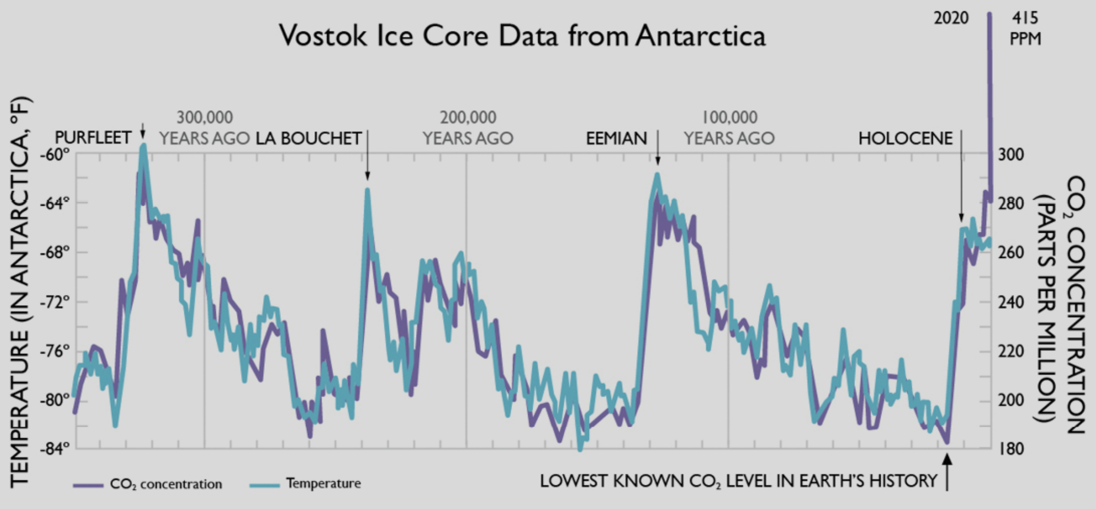
Figure 2: The graph covers the period from 540 thousand years ago (540Ka) to present – the last 20% of the Pleistocene Ice Age. It shows air temperature (blue line) and atmospheric CO2 concentration (red line) above the Antarctic continent. The data comes from measurement of air bubbles trapped in ancient ice which has been recovered by means of deep drilling. Ice cores provide our best calibrated proxy data and offer around 20-year resolution. That data is broadly consistent with results from other types of proxy data from around the globe. Note: CO2 concentrations show good correlation with air temperature, but their highs and lows occur 500-1000 years after the corresponding peaks and troughs of temperature. This suggests that temperature controls CO2 with a multi-century lag, not the other way around.
During the Pleistocene, glaciers repeatedly advanced south and north from the poles, covering land and sea in mid to high-latitude areas with kilometer-thick ice, sculpting the earth beneath. Sea levels rose and fell by more than 100 meters. As a result, some species of plants and animals became extinct and new species (including ours) evolved. The habitats of almost all were widely redistributed. Again, and again and again.
If we bore down into the Pleistocene, we see a pattern of at least 45 advances and retreats of the ice. In the Early Pleistocene, the temperature peaks (interglacials) were regularly spaced at around 41Ka, but from around 1Ma the temperature peaks slowed to cycles at around 100 Ka. Note that the temperatures of these interglacial interludes, even at their peak, were much lower than what been normal for most of the Phanerozoic. The change from 41Ka cycles to 100Ka cycles is known as the Mid-Peistocene Transition. The longer 100Ka cycles are called Dansgaard-Oeschger Cycles after the two Danish scientists who first defined them. Figure 2 shows the last five of these D-O cycles.
It is widely accepted that the 41Ka and 100Ka cycles were caused by minor variations in the amount of solar radiation (insolation) reaching the earth as a result of cyclical variations in the earth’s orbit around the sun (known as eccentricity) combined with cyclical changes in the obliquity of the earth’s rotational axis relative to its the orbital plane. The two cycles are independent of each other. These astronomical events are called Milankovic Cycles after the Serbian mathematician/astronomer Milutin Milankovic who first defined them in 1914.
To summarise: we live in the Holocene, a Stage of the Pleistocene Ice Age. The Holocene is one of dozens of geologically-brief Pleistocene interglacials. Although the Holocene has overarching significance for the development of human civilisation, it has no particular geological significance. Any other point of view is human conceit (see footnote 2).
During the Eemian Interglacial elephant and hippopotami gamboled on mud flats of the River Thames. They retreated south when temperatures plummeted but, around 100,000 years later with the arrival of the Holocene, another species of large African mammal gamboled once again on the Thames.
Climate Change over the Past 12 thousand Years (the Holocene Stage of the Pleistocene Epoch (2))
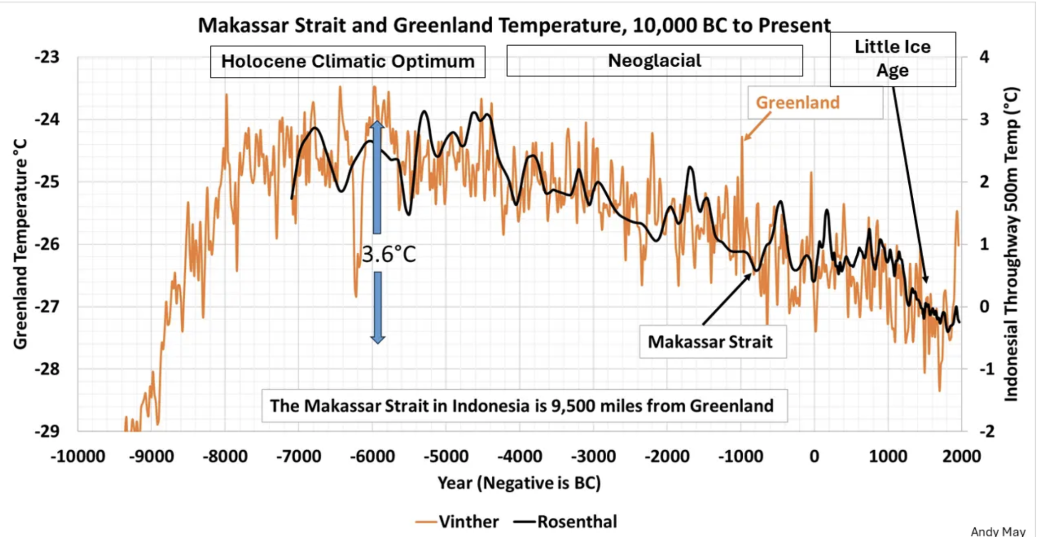
Figure 3: Air and sea temperatures over the past 12,000 years measured from ice core data from Greenland and sea-floor sediment data from the Eastern Pacific. Greenland ice core data is from Vinther et al 2009: (https://www.nature.com/articles/nature08355). Macassar Strait sediment data is from Rosenthal et al 2013: (http://science.sciencemag.org/content/342/6158/617). Compilation of the two data sets was done by Andy May. The correlation between two regions 9,000 km apart, using two different proxy methods, is compelling.
Note the very steep initial rise in Holocene temperatures to a maximum around 6-9000 years before present (known as The Holocene Climate Optimum) followed by a slow and gradual decline to the deep trough in temperatures from around 200 to 800 years before present (known as The Little Ice Age). The upward temperature spike at extreme right is called the Modern Warm Period and it began around 200 years ago. It is only “warm” in comparison the preceding neo-glacial conditions. The graph shows that short-term temperature spikes like this are not unprecedented in the Holocene.
As you can see by comparison of figures 2 and 3, all the interglacials of the Pleistocene for which we have good data followed a similar pattern – a rapid 8-10° C rise in air temperature over a just a few decades, followed by a slow fall over the succeeding millennia. The relentless fall of global temperatures from the Holocene Climate Optimum matches this pattern and is an ominous pointer towards the next cyclical advance in the ice.
Will we survive the next ice advance?
The Modern Warming Trend (which began around 200 years ago – a geological microsecond)- gives faint hope of a delay in the inexorable return of the glaciers. But when that happens, be it in 100-, 500- or 1000+ years’ time, as a species we will surely survive. After all, with lesser technology, we survived the last advance of the ice. But will our civilisation?
Our few descendants (as they shiver before a fire in their caves or trudge through the snow in their furs) will look back with puzzlement on the Global Warming concerns of their 21st Century ancestors (3).
Footnotes
(1) The average global temperature of the lower atmosphere – known as the Troposphere – where all weather is generated – is the most fundamental single measure of global climate. The three graphs I present seek to show the change in lower troposphere temperature over increasingly longer periods of geological time as we look back from the present day. The graphs summarize the best and most up to date that I can locate, but their detail will inevitably be modified as knowledge advances. Note that the further back in time, the greater the uncertainty and the coarser the resolution. It should also be noted that global trends may be amplified or smoothed by regional factors.
(2) In this post I have treated the Holocene as a brief interglacial or Stage (Stadia?) within the Pleistocene. Knowledgeable readers will notice that in this I do not follow the official subdivisions of Earth’s stratigraphy set out by the International Commission on Stratigraphy (ICS). I make no apologies for that. I address this issue in a separate post (see The Happy Holocene)
(3) I explore the topic of fashionable science memes in more detail HERE.
Click for higher resolution images.